
LYNK 09
LYNK 09 infotainment redesign is an improvement and upgrade to provide a better and clearer user experience with operating control panels. Our goal is to redesign the screen system for discharge and ambient light features so that users are more comfortable with the control panel, which potentially helps the company grow.

My Role & Responsibilities
Research, UI Design, Visual Design,
Design System, Testing, Prototyping
TIMELINE
5 weeks
TOOLS
Figma, Procreate, Adobe Illustrator,
Google Docs, Google Sheets
AMBIENT LIGHT FEATURE
ℹ️ OVERVIEW
Electric cars are becoming increasingly popular, and the control panel of an electric car is like its brain. A good experience ensures its proper usage. Imagine if a user couldn't even utilize the charging and discharging functions of an electric car, it would be similar to everyone being unable to refuel a conventional car.
In our usability testing and user feedbacks, we have identified a couple of issues that we are responsible for addressing, which are:
1. Accessibility of the charging and discharging features.
2. Complexity of the Ambient light control panel user interface.
🔖 ABOUT THE COMPANY
Lynk & Co is a brand owned by the Chinese car company Geely. It is at the forefront of electric car motors in China. Lynk & Co was founded in Gothenburg in 2016 and has been mostly a Chinese concern until 2021 when the brand launched in Europe. Lynk & Co is designed to appeal to younger customers who don’t want to traditionally own a car but use one perhaps through leasing, car sharing, and subscription methods. It has a range of petrol and hybrid electric models with the 01 SUV being the first model destined for Europe and the UK.
🚗 BACKSTORY
-
The new lifestyles, like going camping and playing frisbee, are increasingly trendy in China, especially among the 25-45 age group.
-
From the online forum, we also got tons of information about car campers showing the strong need of using hybrid/EV cars.
-
After understanding the dynamic culture of Lynk & Co, we know Lynk wants to bring more energy and innovation to this community.
-
In the user interviews, we collected users’ needs and feedback about existing features and chose the most needed two.

➡️ DESIGN PROCESS
1. Desktop research
2. Competitive analysis
3. Synthesis & analyse interviews
6. Prototyping & present
5.Discuss & finalyze design
4. Narrow down features & convert ideas to mockups
🤔 WHY DO WE DESIGN LIKE THIS?
-
To understand user needs when using an electric car to camp, we conducted 14 interviews with users from 25 - 40 years old with camping experience and some experience with hybrid/EV vehicles. A majority of users demonstrate a strong need of using the function of discharge to meet multiple needs, especially during camping.
-
During our interviews, users expressed strong needs when it comes to the discharging feature. Almost 100% of them consider discharging as one of their main needs. However, they were not clear when operating the discharging panel. The discharge button was not obvious and there was no clear indication of the time, battery, and mileage left.
-
Users also were frustrated by the incomplete ambient light feature. When they try to set up the atmosphere they want, they discovered that the provided preset modes were very limited and they could not add their own settings. It largely affects the user's mood and interrupted the entire flow.
🎯 PROBLEM STATEMENT
-
LYNK 09 infotainment system design is to improve the experience of using the discharge function and ambient light to provide a more immersive, easy operating experience.
📍 KEY FINDINGS FROM USER RESEARCH
-
DISCHARGE
Energy Anxiety
Users are eager to know the exact amount of energy that remains and is being discharged
Energy Efficiency
Users hope to save and improve the efficiency of using energy
-
AMBIENT LIGHT
No customized themes option
This is a strong desire for users to meet their entertainment needs with friends and families while in car.
Difficult to immerse in
This affects users’ connection with car when on camping.
Lack of anticipation
Which affect users experience to interact with ambient light functionality
-
LET'S LISTEN TO OUR USERS:
“Can I know the exact electricity level and mileage my car has before and after being discharged?”
“Can I have a theme of ambient light that can offer me an immersive experience during camping?”
❌ CURRENT PROBLEMS
❓Where would you tap if you simply want to discharge your car?

The charging release button is hidden in the back and confusing to use
Instruction is not clear
Redundent use of graphic element
The information on the buttons seems to be similar
Users lose their patience trying to find the right button to tap on
So, how might we help users improve the experience of using the discharge function in but not limited to the camping context?
💡 OUR SOLUTIONS
ITERATIONS & SKETCHES


In our early ideations, we
-
Reevaluated what information was essential to show on the landing page
-
Rearranged the orders and graphic layout
-
Reconsidered the hierarchy of information so that users can find what they need right away without being confused.
After prioritizing according to the early mockup, we decided to focus on:
-
Increase accessibility, be accessible by default.
-
Organize the page by relevance
-
Bring human-interface objects to consideration
FIRST MOCKUP


After analyzing the initial mockup, we undertook a redesign of the user interface, placing a higher emphasis on the charging release feature and creating a cohesive aesthetic to enhance the visual experience.
We addressed the issue of unclear instructions and improved the clarity and accessibility of the data for users. Through further interviews and usability tests, we have now reached the final design, which is presented below:
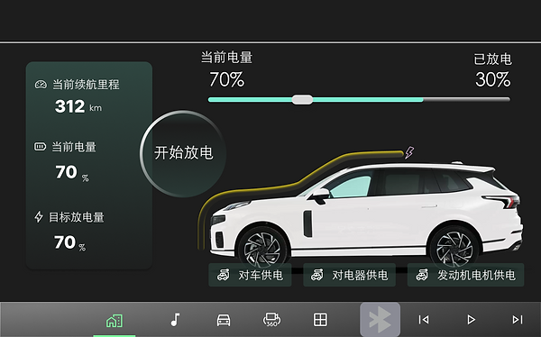
FINAL DESIGN
Battery & mileage display

Discharge button
Simplified menu
Battery bar display

In the final design, we:
-
prioritized the visual elements so that the battery becomes the first read
-
enlarged the current battery and mileage so it's more noticeable for users
-
generated animation to indicate the percentage of the amount of battery discharged

❌ CURRENT PROBLEMS
No customized themes option
This is a strong desire for users to meet their entertainment needs with friends and families while in car.
Difficult to immerse in
This affects users’ connection with car when on camping.
Lack of anticipation
Which affect users experience to interact with ambient light functionality


Limited themes/ models without enough customized settings
Unclear information when scrolling with info disappearing
Information architecture needs to optimize to enhance interaction experience.
How might we modify and enhance the ambient lighting system so that user can have a more immersive and interactive experience while camping?
💡 OUR SOLUTIONS
How does design solve the problems?
-
More interactions with optimizing info caricature to get users involved.
-
Customized themes and settings to meet different needs
-
Immersive scenarios with multiple backgrounds and sounds
✅ Provide only essential information on the menu page
The preset mode allows users to chose one that fits the atmosphere, but they can also personalize each theme.

The menu bar is reorganized by relevance
✅ Customization page to meet different unique users need
By touching the plus tab
The custom options provide unique settings for users

The panel is divided in half to provide clear visual compartmentalization
✅ Customization page to meet different unique users need

✅ Customization page to meet different unique users need

💡 Design System

🔍 RETROSPECTIVE
Design based on user scenarios
Our experience has shown that designing solutions for an infotainment system is distinctly different from designing for a mobile device. There are several factors that must be considered, such as the physical interaction between the user and the screen while in a moving car. Due to limitations in hand gestures, tapping and scrolling are the primary forms of interaction. In addition, the user interface must be simple to reduce driver distraction. These factors were taken into account in our final design.
Explore and Define in a limited timeframe
Among all the features on the Lynk & Co 09 infotainment system, we had lots of options to choose from for our project goal. But considering the limited timeline, our focus pivots on the creative solution for users’ interest in their daily life - camping and deliberately cutting down the features that will not emphasize our project goal.