

AIR READING
Online reading and education platform to all children
My Role & Responsibilities
Usability Test, Redesign, Prototype
TIMELINE
TIMELINE
4 weeks
TOOLS
Figma, Adobe Illustrator,
Google Docs, Google Sheets
ℹ️ BACKGROUND
Air Reading is an online reading and educating platform for pre-k to 3rd-grade children, which was founded in September 2021. As a site that offers a variety of different levels of reading and education to all children, Air Reading brings attention to children’s reading and comprehension skills to achieve an early stage of education for all children, and make high-quality reading instruction accessible to all children.

🎯 OUR GOAL
Our usability testing goal is to discover the problems parents(2C) will encounter during the enrollment process through the official website of Air reading. The evaluation was conducted online by each group member to examine the usability, accessibility, and discoverability of the user interface of the site, and to discover any possible pain points in any steps in the process. Both verbal and observational methods were used to determine any possible reaction the subject may have.
This report includes the details of how we conducted the research, the results we found, and a list of brief recommendations in order to improve the user experience of Air Reading. This report addressed 5 major findings that currently exist in Air Reading’s usability, and 5 recommendations corresponding to each pain point to improve the site’s usability.
📌 OUR METHODOLOGY
The predefined tasks were designed to allow for exploration within certain areas of the website that may need improvement:
Task 1
Find out which leveled class is best for participants’ children
Task 2
Find out how to take a trial class
Task 3
Explore all the teachers’ profile
Task 4
Watch a past reading event
Task 5
Explore enrolling into the program
Task 6
Test the miss-class flow
For the purpose of evaluating the website’s usability and from the consultation with Air Reading, our team has decided on testing the following features:
-
The enrollment process
-
Discover the levels of reading class
-
Make-up class process
-
Overall interface
👨💻 User Test participants
We recruited 8 users to complete this testing. Their background varies but they share one thing in common: all of them have at least one child within the range of preschool to forth grade.

📋 Usability Testing Data
From the data gathered, we conducted information from a variety of groups of parents with distinct backgrounds.
All parents who participated in this user test had a bachelor's or Master's degree. The majority of our testers were females who raised at least one child in their family. The average age of the parents is around 34 years old. 85% of the kids are at school-age, so the parents have the motivation to select a reading program at their kids’ level.
Air Reading Usability Study Result
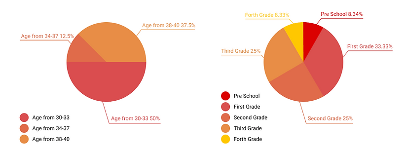
Parent‘s age group
Children's grade level
🗂 Pain Points Prioritization
The pain points with high effect should be addressed first by redesigning Air Reading website. This report’s intention is to address any pain points in usability and serves as guidance to achieve the success of the Air Reading website. For the purpose of improving the website’s usability and from the consultation with Air Reading, our team has decided to focus on these 5 pain points we discovered:
-
The process of choosing the appropriate course level for their children is time-consuming.
-
The credibility of the teachers is questionable to parents.
-
Instead of understanding the value of the course, the price listing drives most of the parents’ attention.
-
The landing homepage is overloaded with unnecessary and obscure information.
-
Participants are confused by the form-filling flow in the process of the make-up class and trial class page.
After prioritizing pain points, we decided to focus on three main pain points which are course level, teachers’ profile, pricing, and the flow of registering for a trial class or making up a class. To better improve the brand image and accessibility, we also worked on branding and color palettes.
📍 Findings & Recommendations
Finding 1: It is not efficient for users to find a suitable level for their children.
Due to the consideration of professionalism of an institute, some words on the Air Reading website are highly professional but users find they are too abstract to understand, such as “phonological”, “CVC words”, and “Lexile Level”. The entire browsing process is inefficient from the participants’ end. The problems are specified and listed below.
1.Time usage.
The average time a participant spent on curriculum selection is the longest among all tasks. On average, the time one user spent is around 4 minutes, while the other tasks can be finished in between 1 and 2 minutes.
2. Users’ quote.
“What do all these words mean?”(P2). From the testing and observation, 92% of the participants complained that they could not understand the academic term and lost patience after browsing for 2 minutes.
3. User behavior.
The common participant behavior is that they browse up and down the page and repeatedly compare different levels because of the vague definition of each level. Participants spend a long time choosing the right level for their child and remain confused. Most of the participants choose the best level of course for their children based purely on the grades below levels.
Before

Recommendation 1
1. Reduce the amount of information listed. Using texts to explain the level requirement only when necessary, using keywords.
3. Using animated and easy-to-understand expressions. Using the image or animation to explain terms like “phonics”.
2. Adding words like “What we expect your kids to have..” or “Your kids will master…” to establish communication with clients in order for them to better understand what different levels mean.
4. Adjust the layout to support more efficient comparing behavior. The vertical scrolling layout can be adjusted into horizontally scrolling cards, which is more convenient for parents to compare the difference between different levels of reading courses.
💡 Redesign : Course Level
To make the information on the landing page clear and straight to the point, we changed the method of displaying by choosing the reading level. Instead of a large amount of text, we replaced it with images so it's more approachable and more accessible to parents.
After

Finding 2: Participants felt the number of teachers and teachers' information displayed on the website is not convincing enough.
The fact that only four teachers are displayed on the teacher profile page caused participants to be confused and question the credibility of the site. The participant said, "why only four teachers?"(p4) during the test. Showing only a limited number of teachers on the homepage makes users challenge whether the site is truly credible and effective or not.
1. Credibility of teachers
The participants indicated that the backgrounds and descriptions of teachers currently provided are not strong enough to be credible and that they wanted more information.
2. Accessibility of teacher's profile.
As the participants browsed the teacher's background, they wanted to try clicking on the teacher's headshot, and when they realized that there was no response after clicking, they said, "Oh, I thought there would be more information when I clicked in"(p5), "How do I know if the teacher's background is true or valid? "(p4) and "I'd like to know more about her"(p5).
Before

Recommendation 2
1. Display more teachers on the teachers page. instead of the only four teachers the website currently has. By doing this, it will both increase the credibility and give users a sense of the diversity of teachers on the site, providing them with more choices.
2. When clicking on a teacher's photo, it is recommended to proceed to another page that shows more information about the teacher in question. For example, mentioned certificates, detailed educational background, detailed work background, hobbies, areas of expertise, videos about self-introduction or previous lessons of the teacher, or reviews of the teacher by previous students or parents. This will greatly enhance the credibility of the teacher and the website and give the user more information to make a choice.
💡 Redesign : Teacher's Profile
To minimize parents' concerns when choosing the right and reliable teacher for their children, we increased the credibility of teachers by adding certification and proof of qualification to reassure the reliance on the teachers.
After

Finding 3: Participants felt forced to pay as they tended to ignore the core value of the classes and solely focused on how much they had to pay.
For each membership plan, deals or savings are not prominently emphasized. Participants only saw how much they have to pay at the moment but ignored how much they could save and what kind of benefits or desirable results they could achieve.
1. Price difference is not addressed enough
For example, when the participant saw the membership plan, the first thing that came to their mind was, “Okay, so they are asking me for money now” (P6). The participant did not notice the strikethrough price or saving amounts listed under the current price. The text size of discount information is small and failed to draw the participants’ attention.
2. User benefit is not clear
Even though there are several points listed introducing the membership, it failed to convey to the participants anything useful regarding benefits the participants can get from enrolling in the program.
Before

Recommendation 3
1. Improve information hierarchy to make deals prominent for users.
For example, the text size of strikethrough prices can be changed to bigger sizes to make them more noticeable. It is important for a business to communicate their offers correctly and obviously to let users better understand there is a price reduction.
2. Explicitly explain what users can benefit from and what students could achieve by enrolling in membership.
It is helpful to list foreseen improvements or achievements of students by attending the classes, such as “helping your children develop their comprehension skills”, or “your children are capable of reading a story independently by the end of the classes’’, etc., so that users would focus more on the value of enrolling in membership and understand that the classes are worth the cost. The users would be more willing to pay once they understand the benefits of buying the product exceeds the costs of it.
💡 Redesign : Pricing
To emphasize the favorable price, we use bright colors and micro adjustments of the typeface to bring the user's attention to the discounted price.
After

Finding 4: Participants spent a long time on the homepage and felt information overloaded.
1. The participants are not very clear about where to find the specific information they need from both the top navigation bar and the main webpage.
Users do not know which areas of the page are plain static content, and which areas are clickable. This would lead to a lower customer retention rate. For example, In order to find the information on reading level, the participants spent more than five minutes scrolling up and down to locate and search.
2. User are not sure about their actions
although it is clear for most of the participants to find information about teachers and reading events, participants are confused about whether or not their actions are effective. “Is this right? Did I click the right button?” “Does this work?” “Oh, it’s loading, it should be this one” ( P7 user). The reason for that is the website does not give instant feedback when the user clicks on the button.

Recommendation 4
1. Minimize cognitive load
According to Miller’s Law, on average, our human beings can hold an average of seven plus or minus two letters, words, or numbers in the working memory. It informs the designer to present fewer options for users to choose from. For example, reorganizing the main webpage, such as removing unnecessary information like books and professional terms, will be a better approach. Instead, the program can clarify the focus area and the main message the program wants to convey.
2. Provide clear entry and exit points
This allows users to easily transition between gathering information and taking actions like integrating a search bar on the top navigation bar so that the users can search for specific information more effectively.
3. System feedback
Based on one of Jason Nielsen’s Usability Heuristics, “Visibility of system status”, the visual changes among different states of the navigation bar needs to be communicated clearly in order to achieve users’ goal. For example, the “Curriculum” button can have a background color change to show a different “hover” or “selected” state.
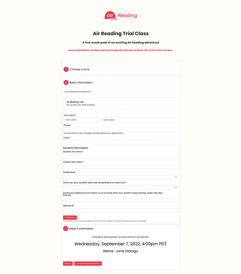
Finding 5: Users are confused about the abnormal scheduling time and are easily misled by the usage of unnecessary buttons.
1. Confusing user flow
4 out of 5 participants mentioned that on both the trial class and make-up class enrollment page, they are confused about the use of the button “Complete Appointment”. Starting from the wizard progress bar on the left, the participants assume that there will be one more confirmation page before they book the meeting for trial or make-up, but after the button from step 2 was clicked, the participants will directly book a session with one of the instructors and the meeting detail will directly be sent to the user’s email. Also, there is no entrance for make-up classes on the front page of the website.
2. Abnormal time schedule
On both the trial enrollment flow and the make-up class flow, there are some abnormal time selection availability like “3 am” in the PST time zone, which is also mentioned by the participants.”3 am? Seriously? I don’t think my kid can wake up that early”(P8) They are not sure if they need to actually follow the instructor’s schedule while the instructor may be in a different time zone or a different country or if it is just a website bug.
3. Unnecessary field of input
Two participants mentioned this problem. “I don’t know why this field is required. I mean, I don’t even use Wechat. Do I need to download it for this?” (P8) On the trial enrollment page, there is a field for Wechat ID, and it is marked as “required”. This field is frustrating for some of the participants since not every participant or potential future users are people from China or mainly use Wechat as the main social media. There are already input fields for email or phone numbers, so participants who don’t have a WeChat ID are confused about what should be input here. The same thing is happening on the make-up class page. There is an input field to enter code, and there is no additional information. There is no hint or explanation about what should be input here or how the user can obtain a “code”. It is not a required field on this page, but it is a big button and can easily distract users’ attention.
Before

Recommendation 5
1. Add an additional confirmation page
With a clear indication of what is the next step for a trial or make-up class enrollment, which means changing the text on the button or giving an additional layer of overlay to make the user confirm that by hitting the button so that they will get a booking confirmation email directly.
2. Adjust the time on the schedule availability page
so that parents can book a time based on their children’s schedules. Also, add some trial or make-up class detailed information on the enrollment page such as instructors’ information, session types (1 to 1 or 1 to many, etc.).
3. Remove or adjust the misleading input field
so that users will not be forced to input some information that’s unavailable for them to provide, or give enough detailed explanation for each individual input field so that parents can fill them out with confidence instead of hesitation.
💡 Redesign : Registration flow
Last but not least, we want to optimize the registration flow for the users. When making reservations, the confirmation page prompted unexpectedly before the parents have a chance to review their information. We made it clear with a confirmation section at the very last step so the users can be sure that all their information are correct.
After
🔍 RETROSPECTIVE
Usability & Accessibility
The usability testing process gave me a more comprehensive understanding of how a product could play impact on users and how usability could affect decision-making. We also paid attention to accessibility in the process of redesigning the app including changing the color contrast and adjusting icon and component sizes.
Product Branding
During testing, we found that some users are not clear about product competitiveness and communication. So we implemented more branding concepts in the redesign and applied them to interaction design.
Communication & collaborate
Air Reading is a startup company looking for furthermore growth and evolution. In this project not only we learned from the product manager and client, but we also learned from each other in the team. Collaboration and communication made us think more clearly and more thoroughly to solve the problem and meet the ultimate goal.
📝 USER FEEDBACK
What do the users think of our new design?
The new design was applied to the website and successfully increased its credibility of the website, users were more satisfied with the flow and were less confused by the overloading information than before.
Air reading wants to develop more customers and provide high-quality teaching services for more children. To get there, users need a better information system to understand the purpose and intension of air reading.